In celebration of Light Work’s 40th anniversary we’re pleased to launch a new identity in conjunction with this brand new website!
More on the website soon. First, lets talk identity… Over the past months we’ve been working closely with Michael Dyer and the team at the Brooklyn-based design firm Remake to develop this new look for the organization — from the logo, to the typefaces, and the pages of Contact Sheet, Mike and his team have carefully developed a more current aesthetic for the oraganization. We couldn’t be happier with the result.
To kick things off, we thought it’d be nice to chat with Mike about the process of developing Light Work’s new identity and show some behind-the-scenes moments of the studio and the design process. Enjoy!
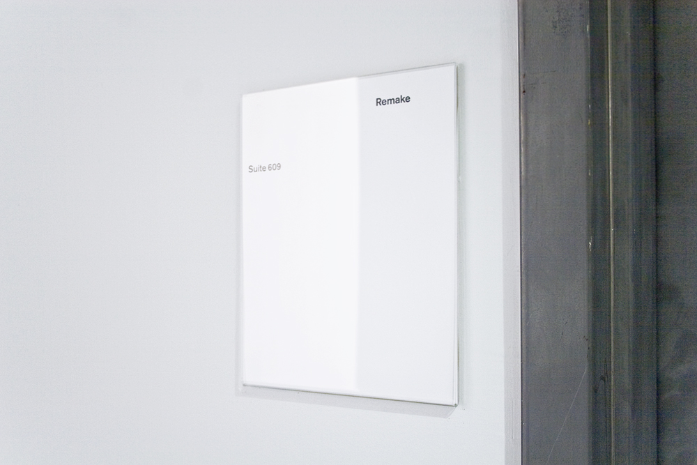
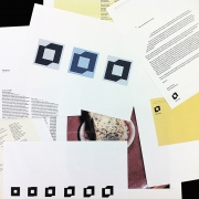
Remake studio, Brooklyn, NY
Shane Lavalette: Tell us about Remake and your approach to design.
Michael Dyer: I started Remake after many years of working for other studios in Washington DC and New York. Remake is intended to be a distillation of my approach to design, which is the reason I started the studio — to put principles directly into practice. Those principles grow out of a concern for the social responsibility of design, and a belief that anything one designs has to justify its existence by contributing to a qualitative improvement in the world. This may sound rather grand, but I really do see design as part of the production of culture.
Remake’s clients tend to often be from allied disciplines — architects, photographers, artists, galleries, museums, etc — although we work with plenty of corporations and businesspeople as well. Variety in clients and projects is important to me. That said, Remake specializes in two areas: corporate/brand identity, and printed publications (with a focus on books).
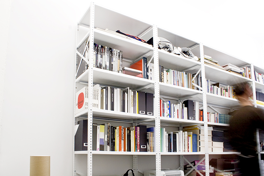
Remake studio, Brooklyn, NY
SL: Reinventing the identity of an organization is a challenging task, especially one as old as Light Work (this year marks our 40th year of supporting artists!). What was your approach in considering possible directions?
MD: In some ways the overall process that we employ for designing a visual identity is rather consistent, and has simply been developed/refined through experience. However, every project requires adjustments to this underlying process. Clients differ, communication objectives differ, audiences differ — all this has to be factored into the approach. But the basic methodology is a strong one and forms the backbone of our process which begins with in-depth discussions and identification of communication objectives, then progresses into exploration, development, refinement, and application of the design system.
When collaborating with Light Work, we had 40 years of history behind the conversations about where we were headed with the new identity. This provided a fantastic foundation on which to build. It also meant that we got a very concise explanation of what makes Light Work what it is, and its exceptionally unique and inspiring support of artists and their work. So we were very well equipped to judge the quality and efficacy of our work as it progressed from inception to application.
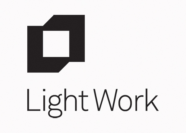
Light Work logo, 2013
SL: The new Light Work logo is minimal, geometric, modern, and is open to a variety of interpretations. How would you describe the ideas behind it?
MD: The new Light Work logo is comprised of two interlocking L shapes that suggest a shifting of perspective and a dialogue or synthesis between two- and three-dimensional form. (I say “suggest” because I think design is stronger when ideas are implied rather than when they are illustrated.) The square at its center represents light emanating from the surrounding form of a frame; it also suggests a view into or out of a space described by that same surrounding form. The square can also be read as representing the individual artist, supported by Light Work as the contextual structure around them.
The symbol being open to multiple viewpoints is, I think, critical to its success. People have to be able to invest a design with their own meaning to an extent. Designing things that are excessively didactic or literal is patronizing to the viewer and limits their ability to participate in the experience.
The new Light Work logo came after a long process of sketching, both by hand and on the computer. I’m a pretty loose sketcher, but there were a couple drawings that had a spark that would eventually lead to the solution, although it took a while for them to reveal themselves. In between, probably a couple hundred different designs were studied on the computer. Once the basic symbol had been designed it went through dozens of iterations. We considered the weight of the form, its compression, its color, how close or far apart the two L shapes were, etc. (And that’s even before we got into how it related to any typography.)
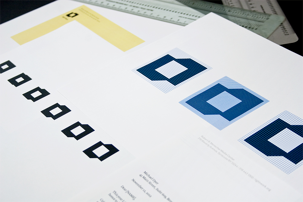
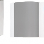
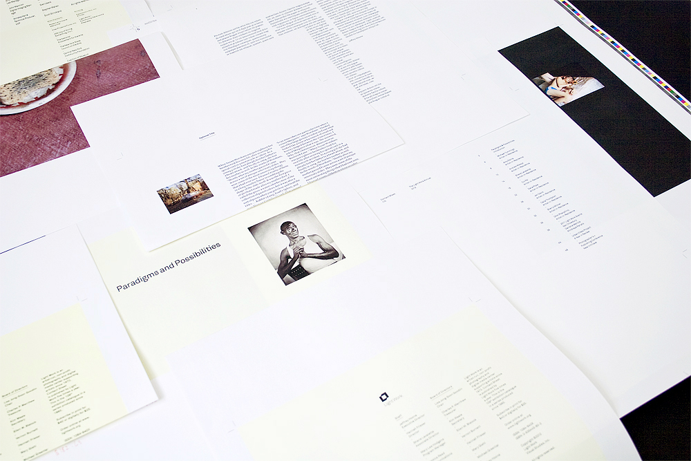
Light Work identity design process, Remake, Brooklyn, NY
SL: As designers, what is your approach to creating a lasting identity? What makes an organizations ‘look’ hold up for 10, 50, 100 years?
MD: 100 years is a tall order. But, yes, a constant concern in identity design, for me, is durability. I don’t endorse the cynical rapidity with which things sometimes change in the design world, especially in identity design where you are operating very near the heart of the institution or business. The process of designing an identity shouldn’t be one of prettifying or applying a cosmetic veneer — it should reach deep into the meaning and being of the organization and express something fundamental. It has to find a bit of the spirit of the organization, and that’s hard to do.
First, as a designer, I think you have to resist the urge to partake in superficial trends. Trends exist to expire. You are doing a client a tremendous disservice by using them as an excuse to participate in the Hot-New-Thing. Second, I think starting from a place of economy is best. Simple designs often endure, when they are carefully conceived and implemented. Third, I think the best work grows from a conceptual and formal synthesis — they are strong ideas expressed in powerful forms. Fourth, and most importantly, a designer has to listen to their client, carefully. This comes before all else. This is how you create something of substance that embodies fidelity to the spirit of the organization.
SL: The photographers and their work are always at the center of what Light Work does as an organization. How does design emphasize this?
MD: Yes, absolutely. Understanding the centrality of the photographers and their work was essential to developing the identity system, and the re-designed Contact Sheet and Light Work Annual as well. As I mentioned above, it’s even subtly referred to in the design of the new symbol itself.
We decided early on that the design system should be relatively quiet. It needed to be strong, it needed to be distinctive, but these did not preclude understatement. Details, always important, assumed an even greater weight. At all points we had to ensure that we were solving the communication problems, but in a manner that not only respected, but enhanced the presentation of the work. By addressing a range of design issues we were also creating a better overall setting within which the artists’ work could exist. In general, I feel the restraint and clarity of the new system is what allows the photographers’ work to really come through, take center stage, and shine.
Light Work identity design process, Remake, Brooklyn, NY
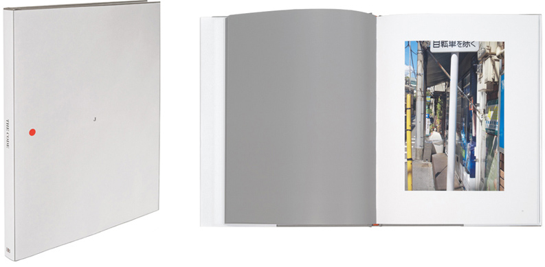
SL: In ‘Remaking’ (excuse the pun) the Contact Sheet, what were some of the biggest changes? What should subscribers be excited about?
MD: Well, the biggest changes have to do with pacing and rhythm. We have worked hard to create something that has a meaningful ebb and flow as a reader/viewer moves through the piece. Engineering a sensitive typographic system has a lot to do with this, as does the structure of the underlying grid on which the design is built. But it’s also about using space more efficiently and dramatically, and color as well, to a more limited extent. We wanted to create a more nuanced atmosphere; this is something that can be very powerful when handled with discernment.
And I feel this is what everyone should be most excited about: the artists’ work will continue to be varied and of exceptional quality; we are just fine-tuning the overall experience of absorbing, contemplating, and responding to that work within the Contact Sheet‘s pages. It’s been extremely exciting for me as well.
—
Subscribe to Contact Sheet to be sure to get the first newly designed issue. Arriving in mailboxes Summer 2013!